|
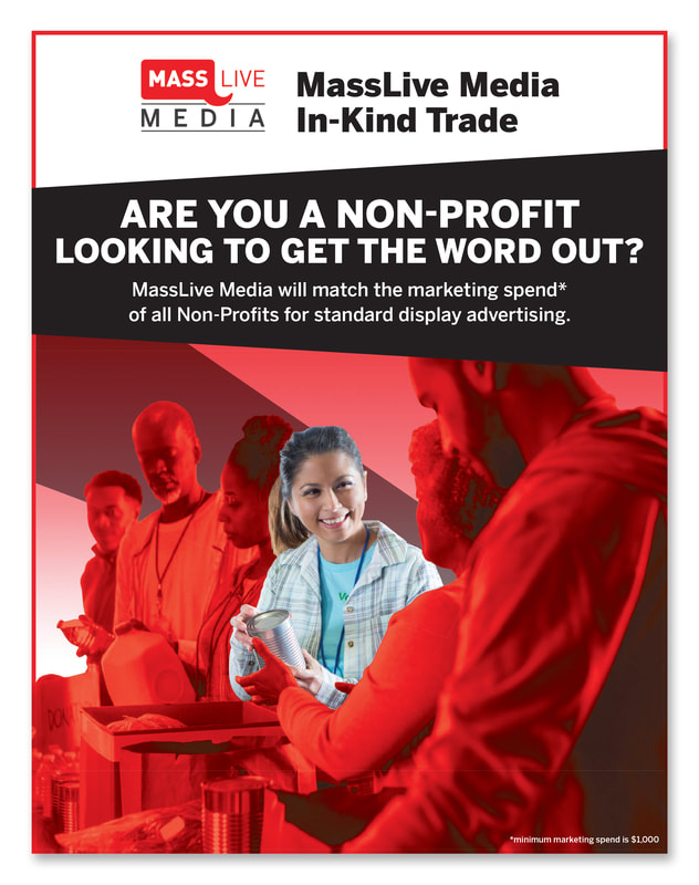
MassLive MediaMassLive Media wanted a flyer design to generate sales of non-profit marketing. They provided a previous example for style reference. Using this as a guide, I decided to create a focal point within the image using a red overlay on the entire image except for the woman in the center. To add dimensionality to the flyer, the diagonal behind the text warps around and down into the image. This brings additional focus on the woman while leading the eye around the design.
|

|
Staten Island AdvanceThe Staten Island Advance (SIA) wanted to create a flyer to promote the reach their site has on real estate listings. To connect the listing examples to the rest of the information, I used SIA branding colors within geometric shapes beneath the samples. These blocks of color also helped create layering within the layout and broke up the copy. For the header image, I used a stock photo that included a "For Sale" sign in front of a house and placed it above the headline to make it easier for the viewer to make the real estate connection.
|
|
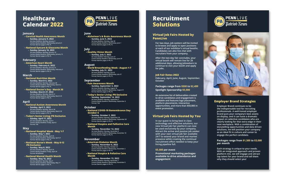
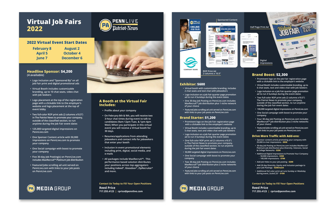
PA Media GroupThe PA Media Group (PAMG) wanted to refresh their flyer layouts with new guidelines. The first flyer to adopt this new branding style was the 2022 Healthcare Event Calendar. It has since been used on additional PAMG marketing flyers, such as the Virtual Job Fairs.
Since PAMG wanted the two colors divided vertically on the flyer, I kept the information divided into two columns. The headline is on one side and the logo on the other. Photos and other non-text visual elements will cross over center to match their new presentation format. Fonts and text colors match PAMG branding. |